

Grainwashing
Why robotics companies are marketing themselves like 1970s documentaries

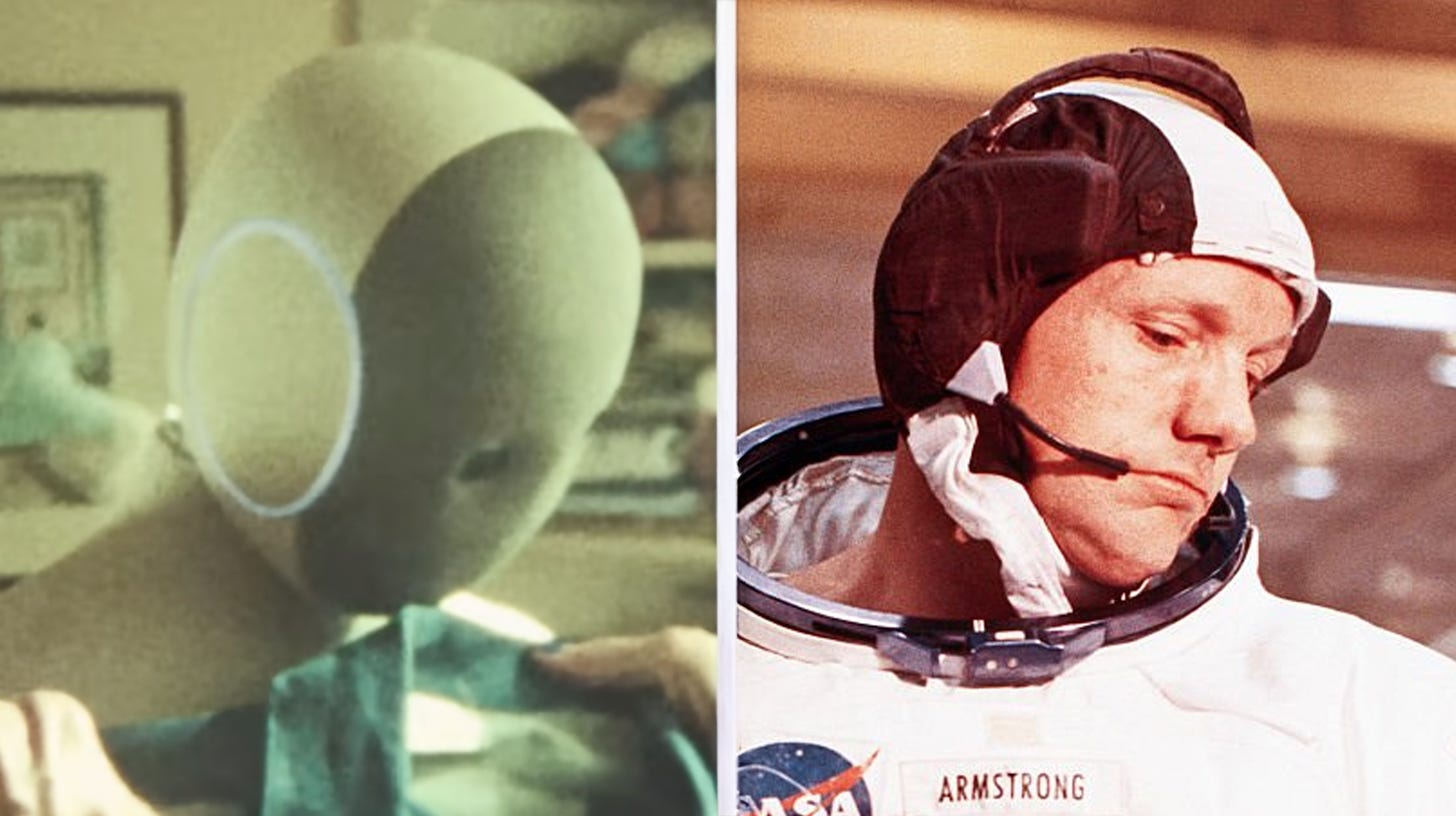
A humanoid robot walks through a sunlit bedroom. Dust motes hang in the air. The camera drifts through a lens flare, revealing grain that suggests it was shot on 16mm film. A baritone voice begins speaking softly over ambient piano — intimate, close-mic'd, like a confession. This is the visual language of robotics marketing today.
It’s modeled after our collective memory of the 1970s.
1x Technologies. CoBot. OpenAI. The companies outputting the most artificial products ever made are all reaching for the visual vocabulary of analog warmth. But this is only part of a much larger trend sweeping pop culture. Project Hail Mary, the (fantastic) Hollywood blockbuster about an astronaut alone on a spaceship talking to an alien, was marketed with the same retro visual grammar. Grain added to the CGI. A trailer that sounds like Carl Sagan came back from the dead to narrate it. And the trend is visible outside of entertainment: vinyl records sold better in 2026 than they did in 1986, Kodak is experiencing a revival, and typewriters are back in vogue. Why?
Because synthetic is scary. In a world where we have no idea if the clips on our phones ever actually happened, where we cannot trust our own eyes unless we saw it happen in-person, film grain stands-in as a shorthand for memory. Borrowing its credibility to establish: this is real, this happened, someone with a body was in the room.
Which is especially necessary to communicate when the truth is nobody was.
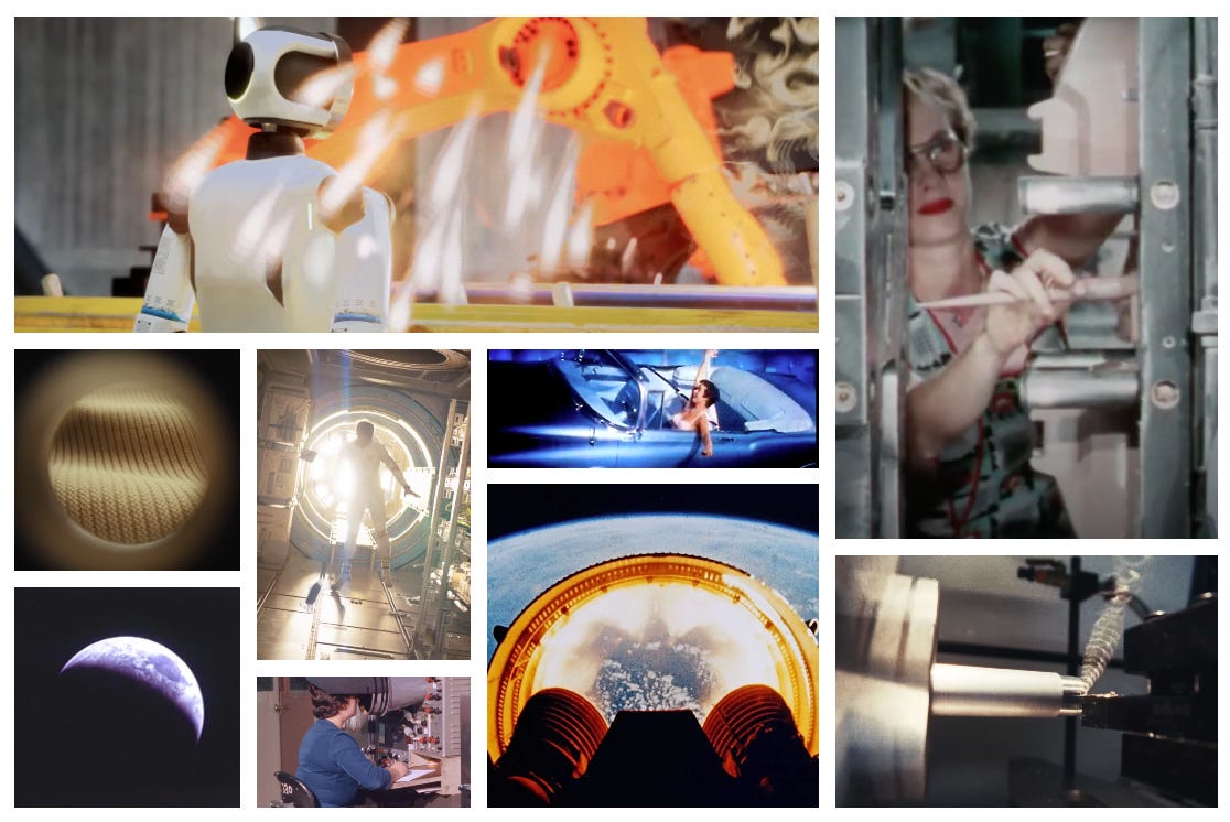
I dug into the historical references that inspired this aesthetic and learned the inspiration is even more hyper-specific than we realize. It isn’t just the 1970s. Turns out, we're all pulling from the same two or three references without knowing it: industrial documentaries and news clips about the Apollo missions.
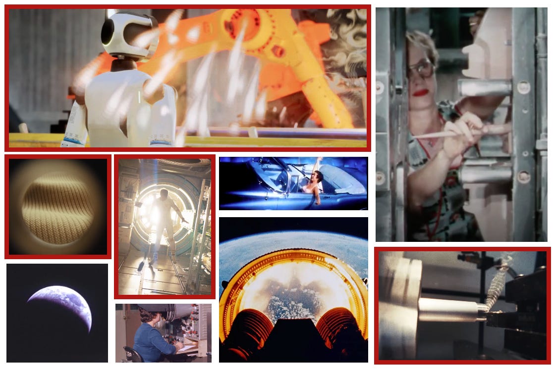
1x’s Building Your NEO campaign shot the most high-tech precision manufacturing ever assembled like it’s the heyday of US Steel and GM. Workers’ hands. Sparks. Metal pieces being machined. All a nod to industrial films that were produced for schools, trade shows, and company meetings during the 60s and 70s. Always narrated by an authoritative, baritone male boasting about the dignity of Amurican labor.
Cobot’s Introduction to Proxie echoes NASA’s Apollo-era news clips. The most glorified manufacturing project in American history. Technicians in white shirts. Gargantuan hangars. That scratchy, close-mic’d voiceover I mentioned earlier? Straight from the radio tones of mission control. One giant leap for mankind.
And here is the most surprising thing I learned while researching — the 1970s doesn’t look nearly as much like the 1970s as we remember. You can find it if you look hard enough. The heat, the haze, the dust in slow zooms and ambient sound design. However, most of the actual source footage from the decade looks sharper, less mythic than the memory implanted by classic flicks like The Right Stuff, Boogie Nights, and Apocalypse Now. So, current robotics marketing isn’t actually imitating the 1970s at all. It’s reaching for the idea of the 1970s we’ve all agreed to remember.
There’s a term for this phenomenon; hyperreality. It was coined by French philosopher Jean Baudrillard in 1981 and asserts that, in postmodern culture, simulations and signs replace the real to the point where we can no longer distinguish between them. In fact, we often prefer the simulation over the authentic, because it’s more vivid, coherent, and emotionally legible than the real version ever was.
I actually love the instincts here. The production design. The cinematography. But it is a tell. An awareness amongst robotics founders and CMOs that their products need softening and a spoon-full-of-nostalgia to make the machine go down. And it’s worth analyzing who is doing it best and who is falling short, because the difference is instructive of what will and will not work moving forward. In my opinion:
1x has wielded the 1970s aesthetic best, because it fits the visual language of the product design. NEO’s humanoid “suit” is 3D printed from soft nylon using a Japanese Shima Seiki machine. Designer Danny Chambers described an internal debate about whether it's "skin or clothing" and said they wanted it to feel "more like a couch than a refrigerator." Once the 16mm grain is added, it feels like a cable-knit turtleneck you can imagine Buzz Aldrin wearing while he polishes off a Harvey Wallbanger, hops into his Corvette Stingray, and cruises to the launch pad.
Cobot not so much. I love Brad Porter’s content, when it’s him speaking truly off-the-cuff to camera. But their Proxie launch video feels like it’s posing as impromptu. And there’s an obvious disconnect between the visual language of the ad and the robot itself, cleanly and beautifully designed in brushed silver and white. It looks like the iPad of robots. Not something narrated by Werner Herzog. Which is likely why the “soft real” aesthetic is used more sparingly and at lower dosage than the 1x example.
So, where do robotics ads go from here? Like everything in marketing, if you’re not first, you look like all of the rest. The fact that I’m writing this essay means the window for this look to feel distinctive in robotics is already closing. But the choice wasn’t arbitrary. It’s encoding something important that must be achieved for embodied AI to succeed. Analog warmth is a peace offering that resonates with audiences who are both sick of — and terrified by — synthetic overload.
The natural evolution will be to drop the grain, drop the nostalgia, but keep the truth. Unscripted testimony from real users, in real homes, ads that feel more like journalism with big-money production value. But that too will have a shelf life.
The better answer is leaning into the unique character of the robots themselves. 1x could do this because they made bold, specific choices about physical form. The rest will struggle, because they’re blank slates without personality. The reason: a defined character feels too risky to bring into a market where even neutral humanoid design flirts with the uncanny valley (also telling: in none of these ads do the robots speak).
So with no character to take cues from, the default becomes borrowing identity and warmth from decades ago. I think that’s the real reason the aesthetic spread so quickly across the category — the other options were either devoid of character or too cold, too futuristic to drive marketing (FigureAI, Boston Dynamics).
The 1970s soft light, hard sell is a short-term trust play we’re all going to get tired of pretty fast. The robotics companies that stand out won't be the ones who color-corrected everything "I love the smell of napalm in the morning" orange. They'll be the ones who decided who their robot is early and allowed the marketing aesthetic to flow from that identity. The launch videos will look like trailers for a movie only that one robot could star in. End of the day, the grain will fade, the character will stay.
Spot on!